Summary
FareWell is a ride-sharing price aggregator, like Kayak but for ride-sharing. I worked on FareWell from late 2017 until the app was acquired by Bellhop Technologies, DBA Obi, in early 2018.
I was the owner and sole contributor, completing everything from UI/UX design to engineering implementation and marketing.
Problem
Uber and Lyft were at the height of their battle in the United States, and it looked like more competition was popping up on both a domestic and international level — DiDi in China, Grab in Southeast Asia, and countless others in every region across the globe. Much like the airline industry, the services were relatively indistinguishable from a rider's perspective and relied on name brand to attract riders. Many people compared prices before fetching a ride, but most didn't due to friction.
Solution
The obvious answer was a price aggregator similar to those available for airlines — Expedia, Priceline, SkyScanner, Kayak, etc. To my surprise, there was only one app on the App Store with a similar concept, but it lacked a good user experience and interface. I decided it was time to build my first mobile application.
Product
After a month of hacking away with an early version of React Native, figuring out how to submit my app to the App Store, and waiting over a full week for approval, FareWell for Uber and Lyft was finally live on iOS. Two weeks later, it was available on Google Play.
The app only has a few key screens and features, but there were a few key design decisions that made FareWell simple and intuitive to use.
Features
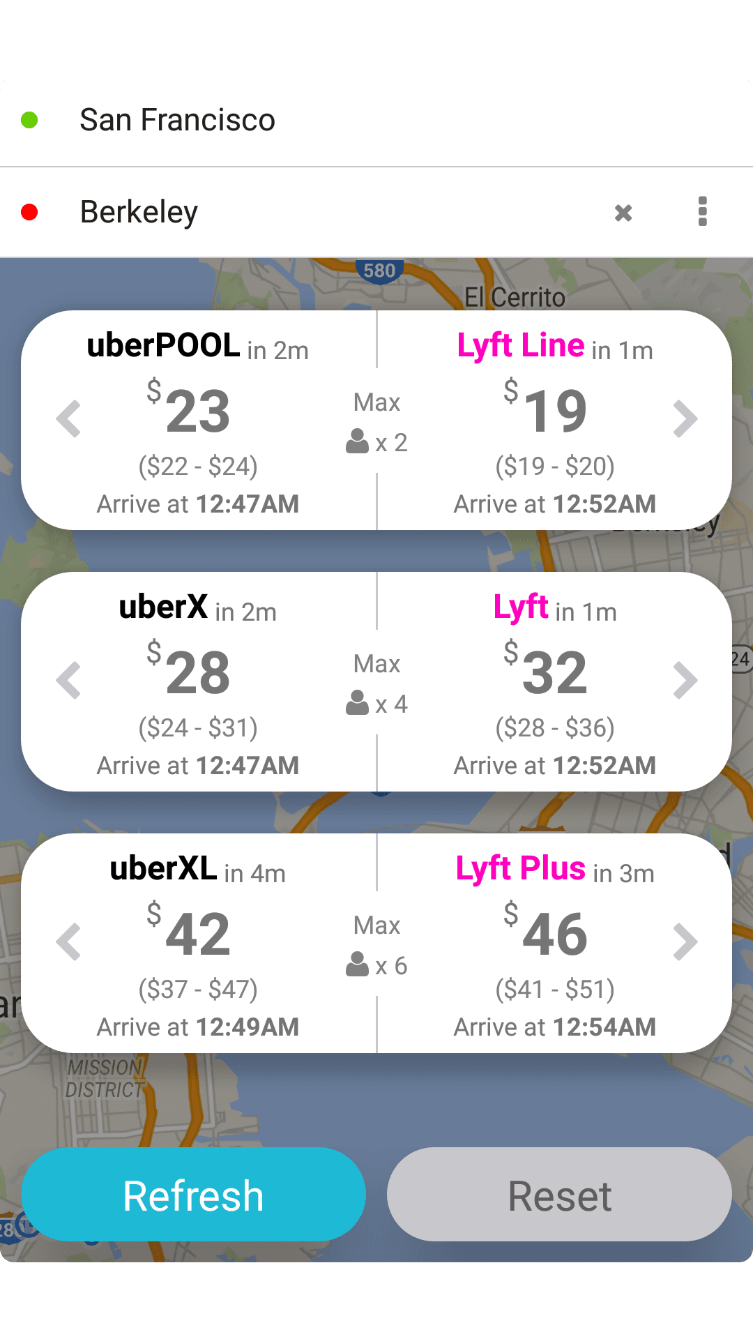
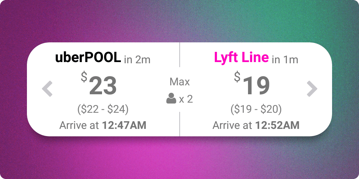
Grouped by Like-services
The only other existing competing app listed prices in a table format and the user could filter the table by selecting the services they wanted to compare (UberX, UberXL, Share, etc.).
After some discussions with potential users, AKA co-workers and friends, about the design I decided to test the assumption that most users already knew what service they wanted. If you had to transport six people you knew you needed an Uber / Lyft XL car. If you were riding alone, you already knew you were looking for an Uber Pool / X or Lyft’s equivalent.
Rounded Prices
This might seem counter-intuitive for a price aggregation app, but there was both a technical and UX reason to round prices.
At the time, the Uber and Lyft API’s returned price ranges, so I averaged the range for each service respectively and clearly displayed the prices as estimates.
The other reason for rounding was that I made the assumption that users weren't so price sensitive to weigh a few cents more than other factors such as wait time. I found that the prices were either so far apart that the choice was obvious (a few dollars or more difference), or they were close enough in price that they could choose whichever ride was more convenient (3 min. wait versus a 12 min. wait).
Seamless Hand-off
To streamline the user experience, once a user clicked on the service they wanted, either the Uber or Lyft app would open with their location and destination prefilled. All that was left for the user to do was confirm their request.
Growth & Monetization
After my initial launch I continued to make small UX improvements but mostly left the app alone. In under a year, the app quickly grew to over 10,000 MAUs and gained interest from various competitors that had popped up over that time.
Conclusion
FareWell was a significant success for my first mobile application. It taught me about mobile UI/UX design, development, the release process, and monetization of applications. The journey from idea to acquisition was filled with challenges and learning opportunities that I carry forward into my future projects.